Flight Centre Homepage Personalisation

Overview
Discovery
I used a lean UX canvas to map out the company's business goals and current challenges. I was able to refer back to the canvas to determine what would help business to achieve their goal and how to approach my research more precisely.
Research
The research phase included:
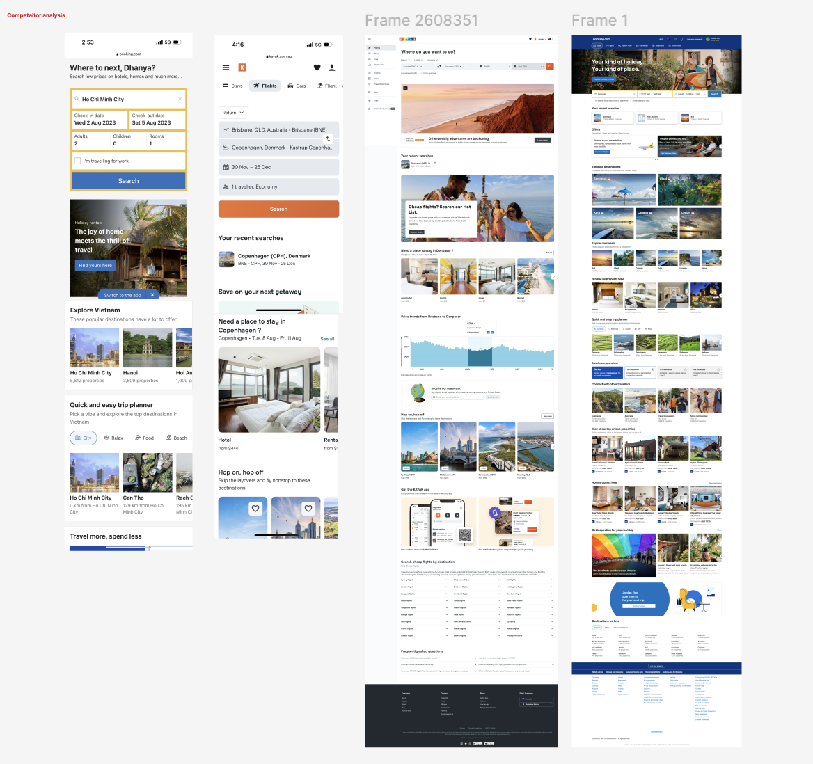
Competitor analysis to understand homepage personalisation strategies used by other travel apps.
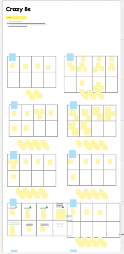
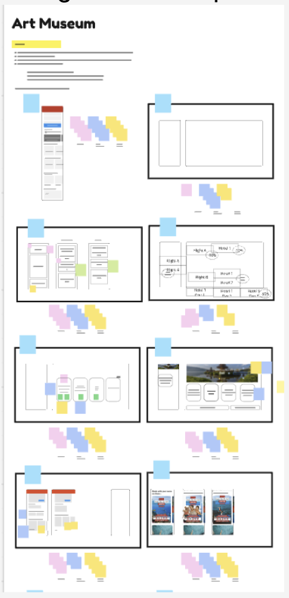
Design sprints with stakeholders to brainstorm ideas and generate concepts.
Identification of key features to enhance the homepage experience.
Insights from these activities informed the overall strategy for a more user-centered and personalised interface.
Ideation
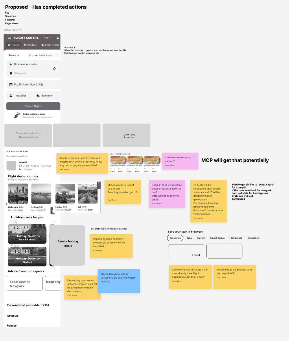
During ideation, I mapped complex user flows, including authentication and homepage access during trip booking. I designed wireframes for each interface, wrote UX copy, and transformed them into high-fidelity designs, incorporating customisation for trips, booking details (flights, hotels, tours, cruises), and promotional content.
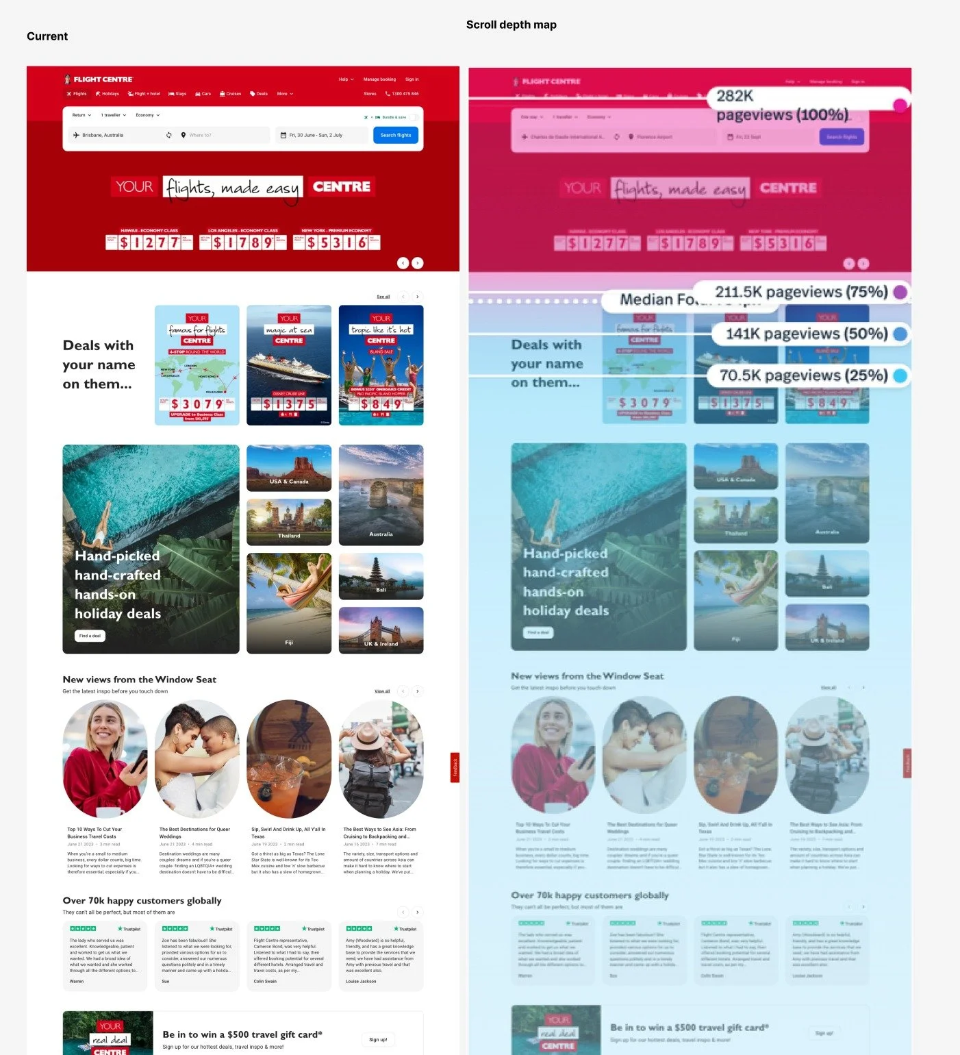
I collaborated with product managers, marketing, and developers in design thinking workshops to explore personalisation opportunities. Using user research, heatmaps, and analytics, we created concepts such as:
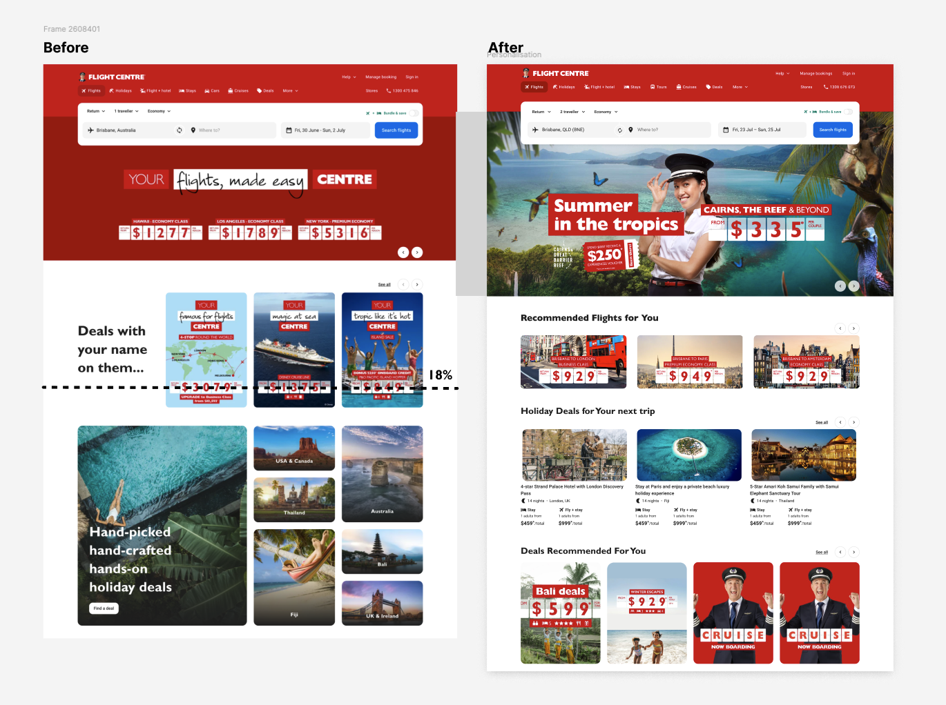
Dynamic destination carousels based on browsing and booking history.
Tailored offers and promotions aligned to customer interests.
Modular layout that adapts to user segments, seasons, or campaigns.
The redesigned homepage surfaced content aligned with user intent:
Personalised destination recommendations
Dynamic travel offers and promotions
Modular layout for adaptable content
Streamlined navigation for easier discovery of relevant products
Implementation
During implementation, I handed over the designs and prototypes to the TOF development team, providing guidance on animations, interactions, and adjustments. I also oversaw marketing asset alignment prior to deployment.
Design Links
Outcome & Impact
Personalizing the Flight Centre homepage led to a 15% increase in click-through rates, a 10% uplift in booking conversions, and a 12% growth in average basket size. Customer engagement and loyalty also improved, with a 5-point rise in NPS and a noticeable increase in repeat visits. The enhanced homepage experience proved that personalized content drives both user satisfaction and measurable business growth.
Flight Centre Travel Group, one of the world’s largest travel agency groups operating in 23 countries, provides customers with flights, accommodation, cruises, experiences, and more. The Flight Centre mobile app allows users to easily search, compare, and book travel while accessing exclusive deals.
The original app homepage served generic, one-size-fits-all content, which often left users frustrated and disengaged. As Senior UX Designer, I led the redesign of the homepage with a focus on personalisation, tailoring content to user interests, behaviours, and booking history.
Through user research, data analysis, and iterative design, the personalised homepage significantly improved engagement, including deeper scroll depth, higher customer satisfaction, and more intuitive pathways to conversion.
Business Goals
Reduce bounce rate from homepage.
Effective communication of best deals available for customers.
Increase conversion from homepage.
Increase average basket value in size.
Workshop with Stakeholders
User Experience Metrics and KPIs
Return of Investments
Demonstrating the value of design by driving key improvements that directly contribute to revenue growth and customer retention. Ensuring that all measurements and outcomes align with the business’s North Star Objectives.
‘Reinforcing design as a strategic lever for business success. To empower a duty of care within corporate security teams of organisations. Based on the risk profile, Intelligence, alerts, and incident reports are all designed to provide the traveller with an understanding of the risk environment. The destination they are travelling to for the duration of their trip.’ - NSO
UX Metrics Source
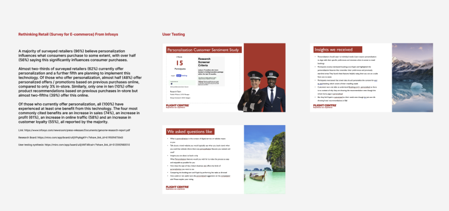
Customer Surveys.
User Interviews.
Customer documentation.
Quantitative analysis, through competitor analysis and heuristic audits of the current portal.
We conducted guerrilla surveys and testing of simple ease-of-use ratings around specific tasks
Key Performance Indicators
Engagement Metrics
Measure how effectively personalisation draws users in.
Click-through rate (CTR) on personalized modules (e.g., “Recommended trips,” “Recently viewed destinations”).
Time on page / session duration – longer engagement can indicate relevance and user interest.
Scroll depth – how far users explore personalized content.
Conversion and Revenue Metrics
Track how personalisation impacts business goals
Conversion rate uplift (e.g., bookings or inquiries after viewing personalized offers).
Average order value (AOV) – higher spend per transaction due to relevant suggestions (e.g., add-ons, upgrades).
Revenue per visitor (RPV) – a holistic measure of personalization ROI.
User Retention and Loyalty
Evaluate long-term effects
Return visit rate or repeat bookings – how many users come back after experiencing personalisation.
Account sign-ups / saved itineraries – indicators that users see ongoing value.
Customer Lifetime Value (CLV) – improved through stronger engagement loops.
Experience and Satisfaction Metrics
Gauge how personalisation affects user perception.
Net Promoter Score (NPS) – changes after personalisation rollout.
Customer satisfaction (CSAT) scores for homepage experience.

Challenges
Standing out against larger booking platform
Understanding customer behavior.
Objective
Validate hypotheses around the Enhanced Intelligence Map and new Risk Level Component models.
Understand core business requirements driving the initiative.
Gather insights from key stakeholders on expectations and needs related to the Enhanced Intelligence Map.
Identify key pain points to inform design and functionality
Purpose
To facilitate focused, collaborative sessions aimed at solving key UX challenges and driving progress across the design scope. These workshops help define the Minimum Viable Product (MVP) and identify opportunities for future enhancements.
They also serve to build a shared understanding of the overall project direction, key milestones, and product vision, ensuring alignment across the entire team.
Outcomes
Validation of our hypotheses.
Clear identification of the relevant users or customer segments.
Deeper understanding of user needs, motivations, and behaviors.
Build empathy across the team to inform user-centred design decisions.
Establish clarity and consensus around the user perspective to guide future design and development.
