Simplifying Cruise Booking

The Product
Flight Centre is a global travel and tourism retailer, offering holiday products to travellers worldwide. The business aimed to enhance the online cruise booking experience, making it simpler and more intuitive for customers to book cruises directly online.
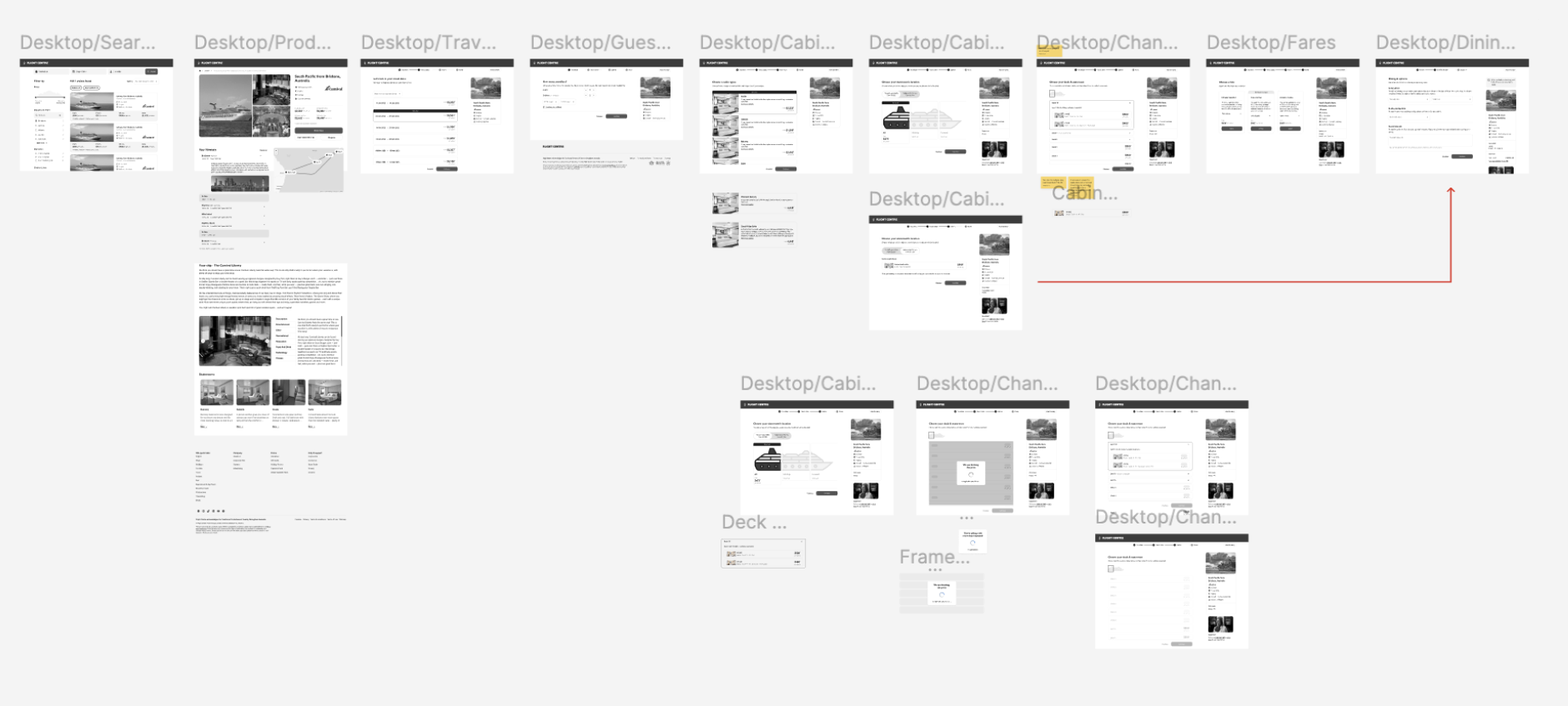
We developed a cruise booking website that allowed customers to search itineraries, explore detailed cruise information, select cabins and preferences, and complete bookings seamlessly.
A critical aspect of the platform was helping customers choose the right cabin. Since cruise guests spend significant time onboard, selecting a suitable cabin is a key part of the experience. While in-store consultants traditionally support customers in this decision, the website was designed to provide similar guidance digitally, ensuring users could make informed choices with confidence.
Problem
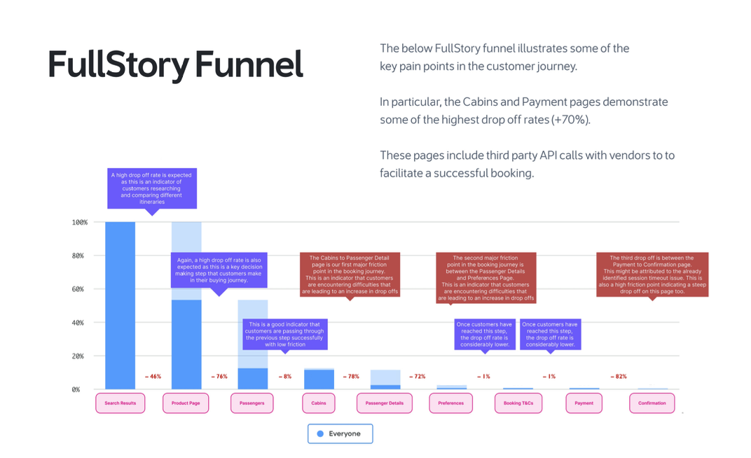
Following the launch of the cruise booking website, FullStory was implemented to monitor user interactions and uncover friction across the booking funnel. Analysis revealed significant drop-offs at multiple stages — most notably during Cabin Selection, Room Upgrades, and the Add-Ons (Extras and Drink Packages) stages.
While users were initially engaging well during the browsing and itinerary selection phases, conversion rates declined sharply as they moved deeper into the booking flow. Funnel analysis showed a ~70% drop-off on the Cabin Selection page alone, with further attrition occurring as customers encountered additional decision points.
Session recordings revealed several root causes:
Overly complex decision flows requiring users to navigate multiple, layered steps (selecting Cabin Category → Cabin Grade → Specific Cabin Number).
Unclear pricing logic and a lack of contextual explanations for upgrades, amenities, or package differences.
Generic, non-personalised recommendations, forcing users to sift through irrelevant options instead of seeing choices tailored to their preferences or past selections.
Cognitive overload caused by too many similar-sounding offers (e.g., multiple drink packages, meal plans, or excursion bundles with subtle distinctions).
Inconsistent information presentation — users often struggled to compare value across cabin types, upgrade levels, or add-ons due to missing or fragmented details.
Together, these issues created a disconnected and impersonal user experience, increasing uncertainty and decision fatigue. Many users dropped off before completing a booking, not because of price sensitivity, but due to confusion, lack of clarity, and insufficient guidance.

UX Research
FullStory was a key tool for gathering insights into user behavior. I used the platform to create detailed funnels that tracked customer journeys and interactions, allowing me to identify potential pain points. These findings were then clearly visualized and communicated to the product team to inform design decisions.
Hypothesis
Simplification Hypothesis
If we simplify the whole booking process by reducing steps and clarifying the difference between cabin categories, grades, and step-by-step booking journey with visual progress tracking and contextual guidance, then users will feel more supported and complete the process more confidently.
FullStory data showed ~70% drop-off during Cabin Selection, with confusion caused by layered options and unclear hierarchy.
Funnel completion rate
User reported confidence (survey)
Error rate (misclicks / back navigation)
Transparency Hypothesis
If we provide clearer pricing breakdowns and visual comparisons for upgrades, drink packages, and add-ons, then users will feel more confident and progress further through checkout.
Personalisation Hypothesis
If we introduce personalised recommendations (e.g., relevant cabins, meal plans, excursions), then users will find the process more efficient and engaging.
Rationale
Session replays showed users abandoning flows due to unclear upgrade logic and unexpected fees.
Current flow shows the same options for all users, causing cognitive overload and decision fatigue.
KPI
Conversion rate from Upgrade/Add-on page
Drop off at Extras/Drink Packages step
User-reported trust and clarity score (survey)
Engagement with recommended options
Conversion rate from personalised offers
Average basket value (AOV)
Expected Outcome
Drop offs reduced by 30%-40%
Time to complete selection reduced by 25%
Task success rate > 85%
Upgrade conversion rate +15%
Drop off reduced by 25%
User clarity score ≥ 4.5/5
Engagement +20%
Conversion uplift +10%
AOV +12%
Testing Methods
Quantitative: Funnel analytics (FullStory, GA4), A/B testing, and conversion tracking.
Qualitative: Usability testing, think-aloud studies, post-test surveys (confidence, clarity, satisfaction).
Created customer blueprint to identify where the pain points and what could be the opportunities
Iterative Evaluation: Run in 2–3 week sprints, prioritising high-impact hypotheses (Cabin Selection and Pricing Transparency first).
Competitor analysis
Customer Blueprint

Design Principles
Delivering a consistent and user-focused experience required balancing design integrity, technical feasibility, and business constraints within an evolving ecosystem.
Balancing Design with Constraints
The journey has involved navigating several complex and sometimes competing priorities:
Information hierarchy & consistency
Maintaining clarity across mixed journeys, especially where Everyday Market and Grocery intersect, required a re-evaluation of content structure and prioritisation.
User control vs legal & brand compliance
Design decisions had to meet strict legal requirements, brand colour hierarchies, and existing UI library rules. Hard constraints around call-to-actions and interactive elements shaped what was possible.
Evolving UI patterns
Updates to the core Woolworths design system meant adapting to changing guidelines midstream, while also contributing feedback to evolve the library to serve mixed fulfillment better flows. Build customer trust through a transparent and seamless fulfilment journey that rivals leading e-commerce platforms.
Technical Feasibility
Not all data points required to deliver the ideal experience were available at the time:
Some back-end fulfillment logic and APIs limited what could be shown to users — especially in early checkout and post-order tracking experiences.
The architecture informed which solutions were viable now, and which would need iterative delivery in future sprints.
Key Performance Indicator
Booking Flow Efficiency
Increase booking completion rate by 20%
Reduce drop-offs (Cabin Selection → Payment) by 40%
Cut average booking time by 40–50%
Personalisation & Engagement
Increase engagement with recommended options by 25%
Raise adoption of add-ons and upgrades by 15%
Achieve 20%+ click-through rate on “Recommended for You” sections
Increase average basket size (AOV) by 10–12%
Transparency & Confidence
Improve pricing clarity score to 4.5/5 or higher
Reduce confusion-related drop-offs by 40%
Ensure all costs and inclusions are visible before checkout
Customer Satisfaction & Trust
Increase NPS by +5 points
Raise CSAT to 4.5/5 or higher
Grow repeat bookings by 10% year-over-year
Ideation
Enhanced and Simplified Cruise Booking Journey
To address the high drop-offs and confusion identified across the booking funnel, we designed an enhanced and streamlined cruise booking experience that reduces cognitive load, shortens booking time, and introduces personalised recommendations at every stage of the journey.
The redesigned experience focuses on three key pillars: Simplification, Guidance, and Personalisation.
Simplified, Guided Booking Flow
Consolidated the multi-step cabin selection process into a single, intuitive interface that clearly displays Category, Grade, and Available Cabins together, with visual ship maps and live pricing updates.
Introduced a guided step-by-step booking flow with clear progress indicators (“1. Choose Cabin → 2. Add Extras → 3. Review & Confirm”), helping users stay oriented and confident.
Reduced redundant inputs and page reloads, enabling users to complete their booking in 40% less time.
Added inline help text, tool tips, and visual comparison cards to clarify differences between cabin types and upgrades.
Transparent and Contextual Pricing
Implemented real-time price visibility with clear breakdowns of inclusions (meals, drinks, Wi-Fi, gratuities) and optional extras.
Designed side-by-side comparison panels for upgrade options (e.g., Balcony vs Suite), showing the value difference visually rather than through text-heavy descriptions.
Improved trust and decision confidence by eliminating hidden fees and surfacing all costs before checkout.
Personalised Recommendations throughout the journey
Integrated AI-driven recommendations that adapt dynamically to the user’s context — surfacing relevant cabins, add-ons, and packages based on traveler profile, group size, and itinerary preferences.
Added a “Recommended for You” module on the Extras and Add-ons pages, suggesting drink packages, excursions, and experiences aligned with past behavior or trip type (e.g., adventure, relaxation, family).
Enabled cross-stage continuity — selections in earlier steps (e.g., destination or group composition) inform later recommendations to create a more seamless, human-centred flow.
Personalized post-booking communications to reinforce engagement and upsell relevant services (e.g., dining reservations, shore excursions).
Outcome Goals
Reduce total booking time by 40–50%.
Increase booking completion rate by 20%.
Cut average booking time by 40–50%
Drive higher average basket value via well-timed, personalized add-on recommendations.
In summary, the redesigned cruise booking experience transforms a fragmented, complex journey into a streamlined, intuitive, and personalised flow. By reducing friction and presenting relevant options at the right time, users can make faster, more confident decisions—resulting in higher conversions, stronger trust, and a more enjoyable booking process.

Design Links
Results
Booking Flow Efficiency
Increased overall booking completion rate by 22% after redesign.
Reduced drop-offs across the Cabin Selection and Add-ons flow by 45%.
Shortened average booking time by nearly 50%, from 8 minutes to just over 4 minutes.
Achieved an 88% task success rate during usability testing, showing significant improvement in clarity and navigation.
Personalisation & Engagement
Introduced tailored recommendations that led to a 28% increase in engagement with suggested cabins, packages, and excursions.
Improved add-on and upgrade adoption by 18%, with users selecting more relevant extras.
“Recommended for You” sections achieved a 23% click-through rate, confirming strong interest in personalised content.
Transparency & Confidence
Improved pricing clarity scores to 4.6/5, with users highlighting easier comparison and understanding of inclusions.
Reduced confusion-related abandonments by 42% after adding transparent cost breakdowns.
Achieved higher trust ratings through early visibility of all fees and inclusions in the booking flow.